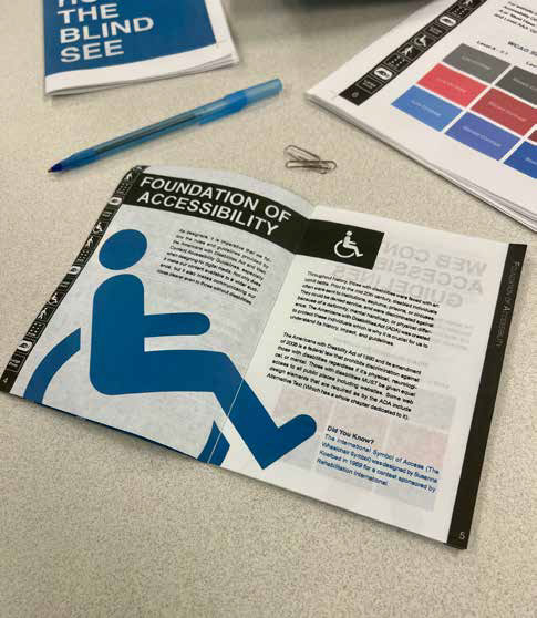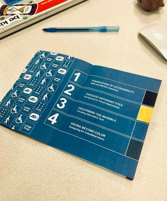
When I started on this project, my goal was to create a comprehensive how-to guide that delves into designing for visual impairments and color blindness. Additionally, I aimed to provide a rich historical context on accessibility and emphasize the importance of the ADA (Americans with Disabilities Act) and WCAG (Web Content Accessibility Guidelines) for designers.
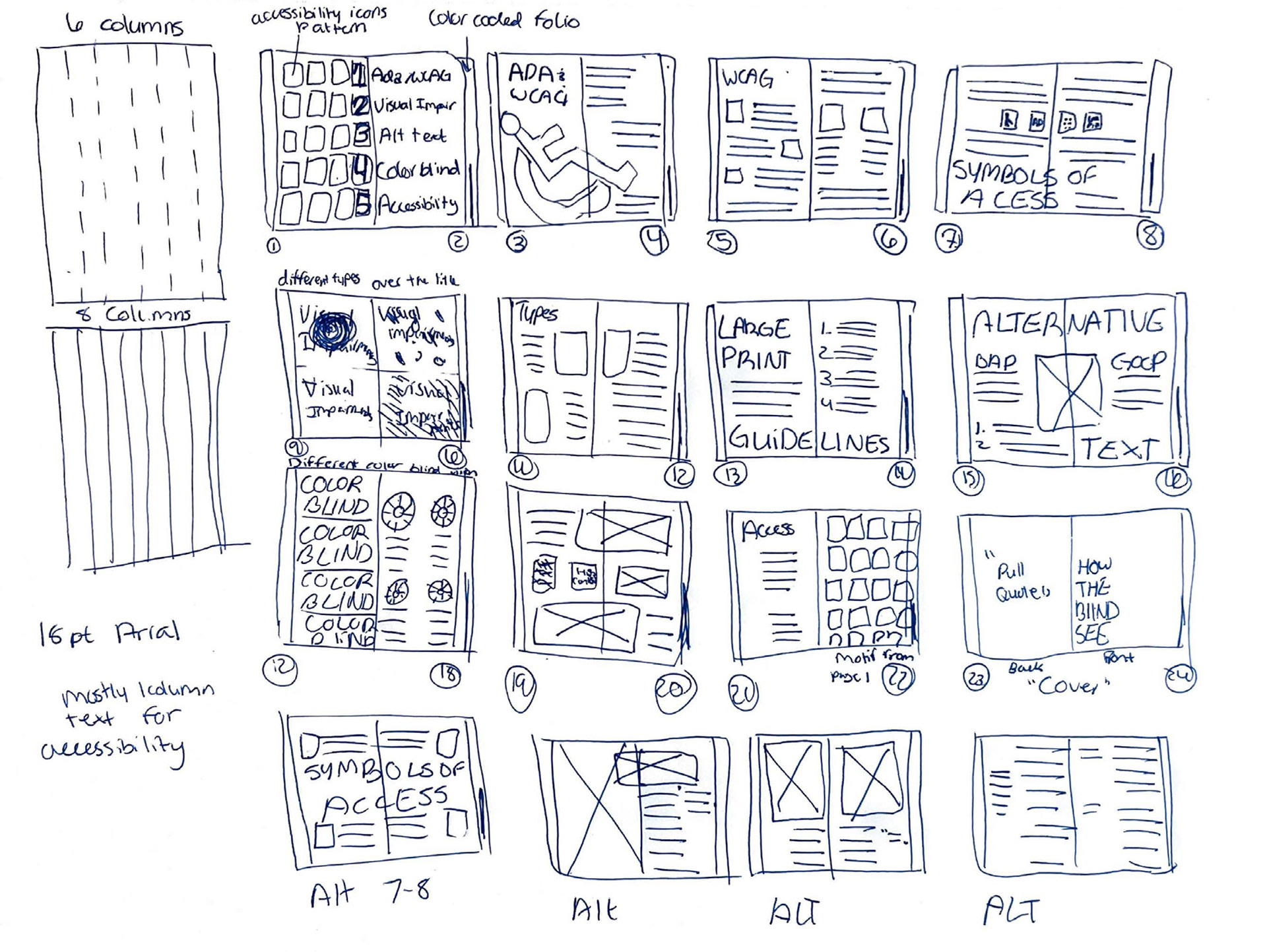
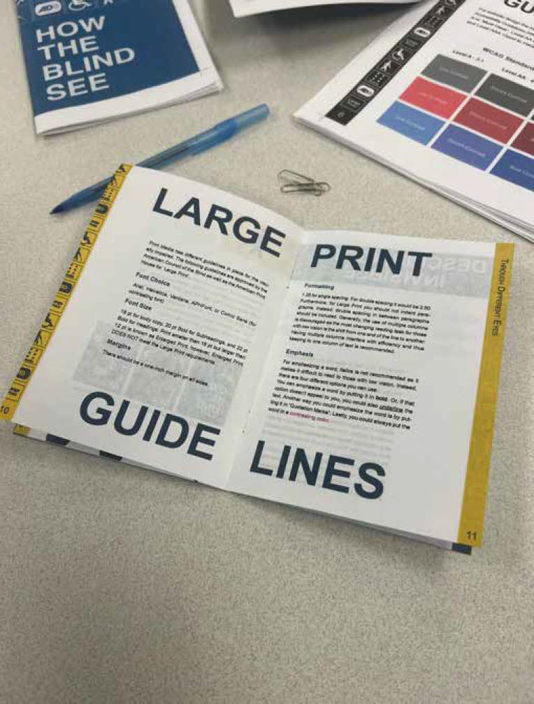
In the design process, I wanted to demonstrate that it's possible to create an accessible design without compromising creativity. To achieve this, I focused on using one-column text blocks when able, accessible typefaces, and colorblind-friendly color schemes. The guiding principle for this monograph is "The Medium is the Message," ensuring that every design choice accommodates those with visual impairments.

This project was deeply personal for me, as my grandfather is completely blind. I wanted to create something that would help people with his condition. While researching guides and guidelines, I noticed that many of them were very generic (which is a good thing as they are accessible). However, I believe you can be accessible while still having fun and playing with design.
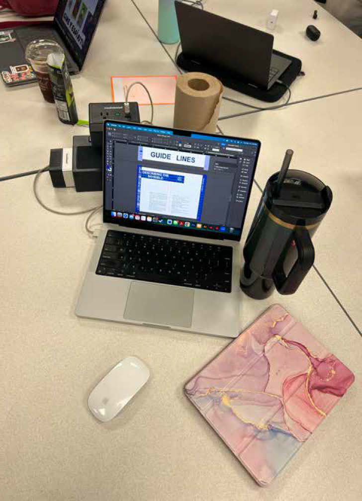
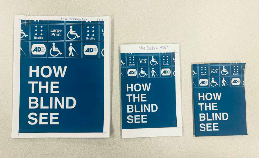
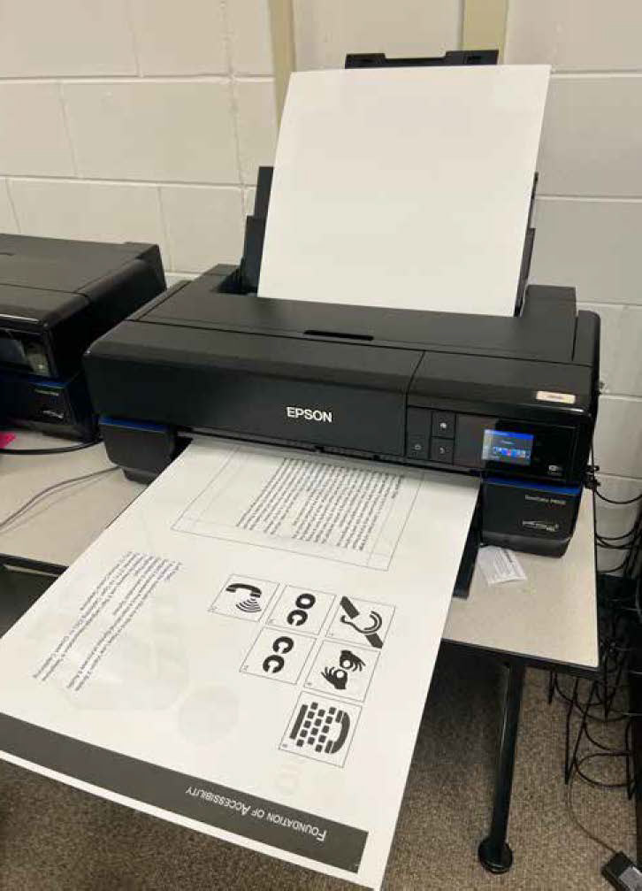
I went through several iterations of the monograph, and just when I thought it was done, it wasn't. I made countless edits and sought advice from my peers to gather a diverse range of opinions. I created mockups to see how it looked at different sizes, even though the final size for each page is 11 x 15. In the end, I'm proud of the product I created and hope designers find value in 'HOW THE BLIND SEE'.