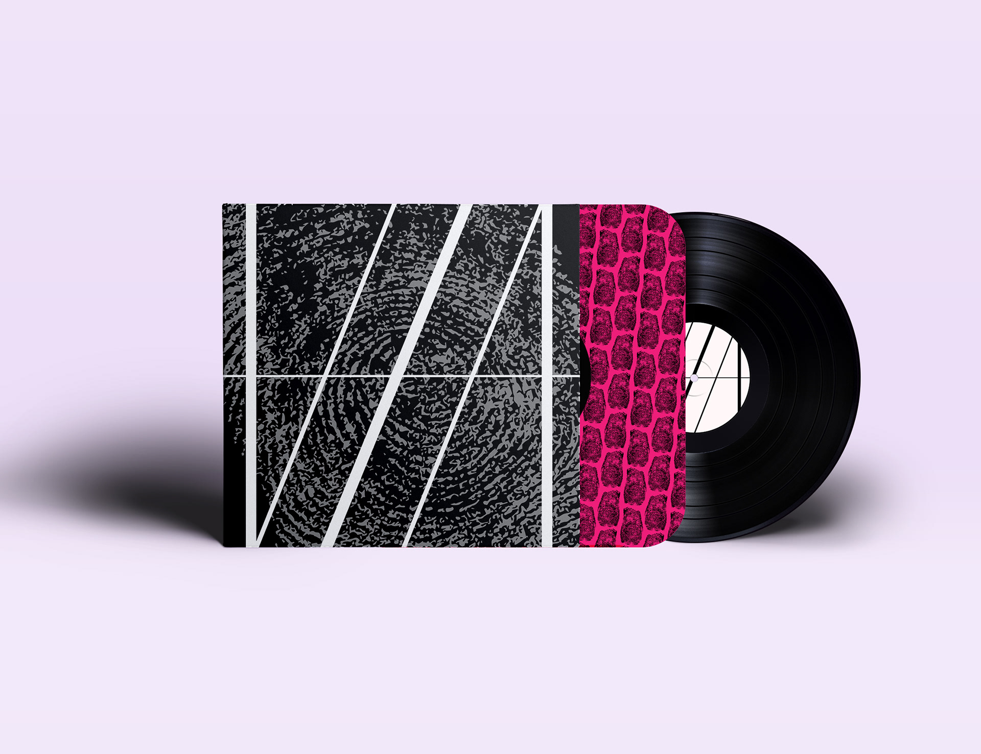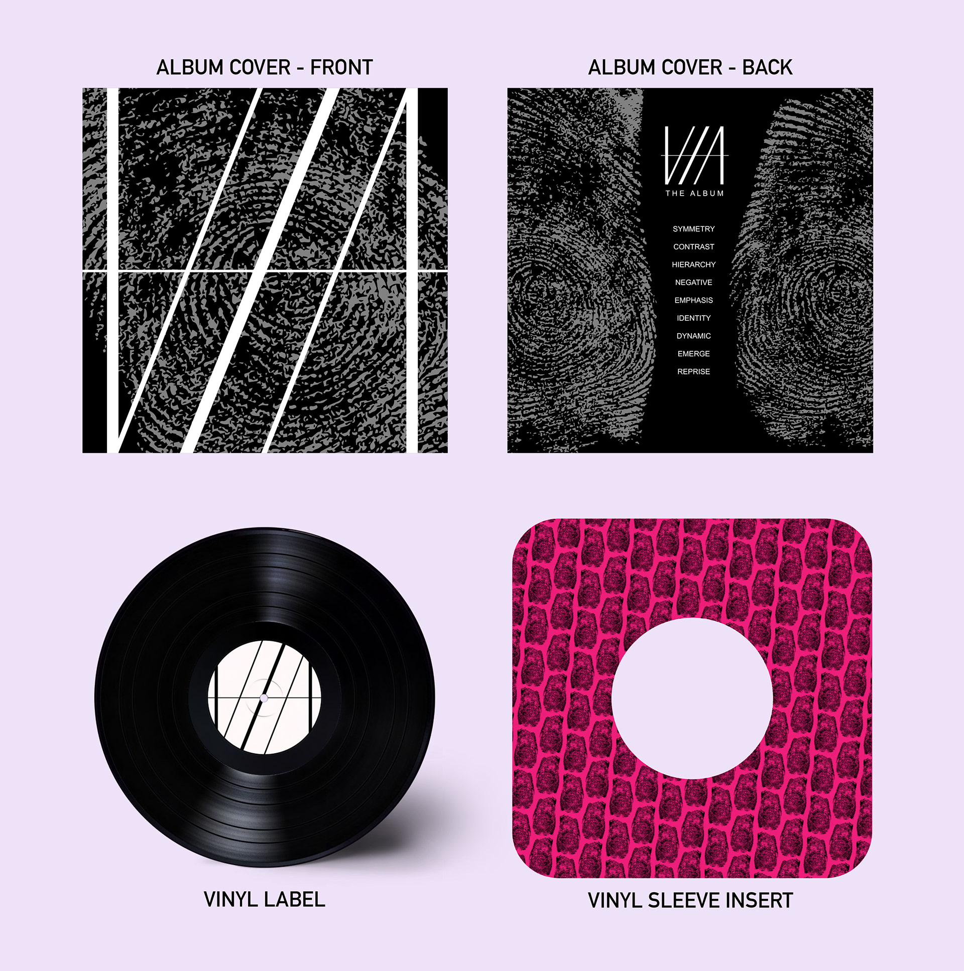

I adore vinyl records and have been collecting them since I received my first record player at 17. Every detail of a vinyl's packaging is crucial in telling its collective story from the cover design to the inserts. For this conceptual packaging design, I decided to interpret what my personal brand would be if it were a pop-punk album—thus, VIA: The Album was born. I started with my signature logo, the Via Ambigram. The ambigram is perfect for an album since, no matter which side you view it from, it still reads "VIA," making it ideal for the vinyl label.
To achieve a grunge aesthetic, I added my own fingerprint and scaled it up. Black and grey fit the punk theme well, but to elevate it to the pop-punk aesthetic, I turned to the sleeve insert. I made it hot pink, giving the design a more feminine edge while enhancing the punk vibe I aimed for.
Fun Fact: The song titles on the back of the album cover are an acrostic for my surname.