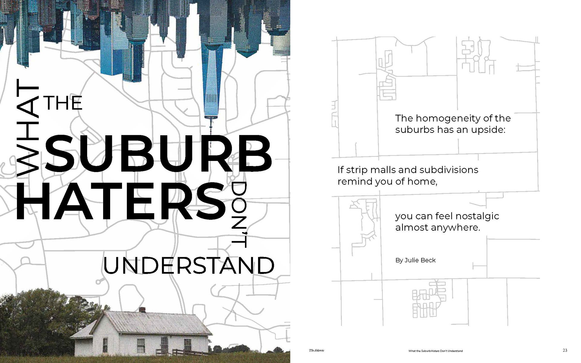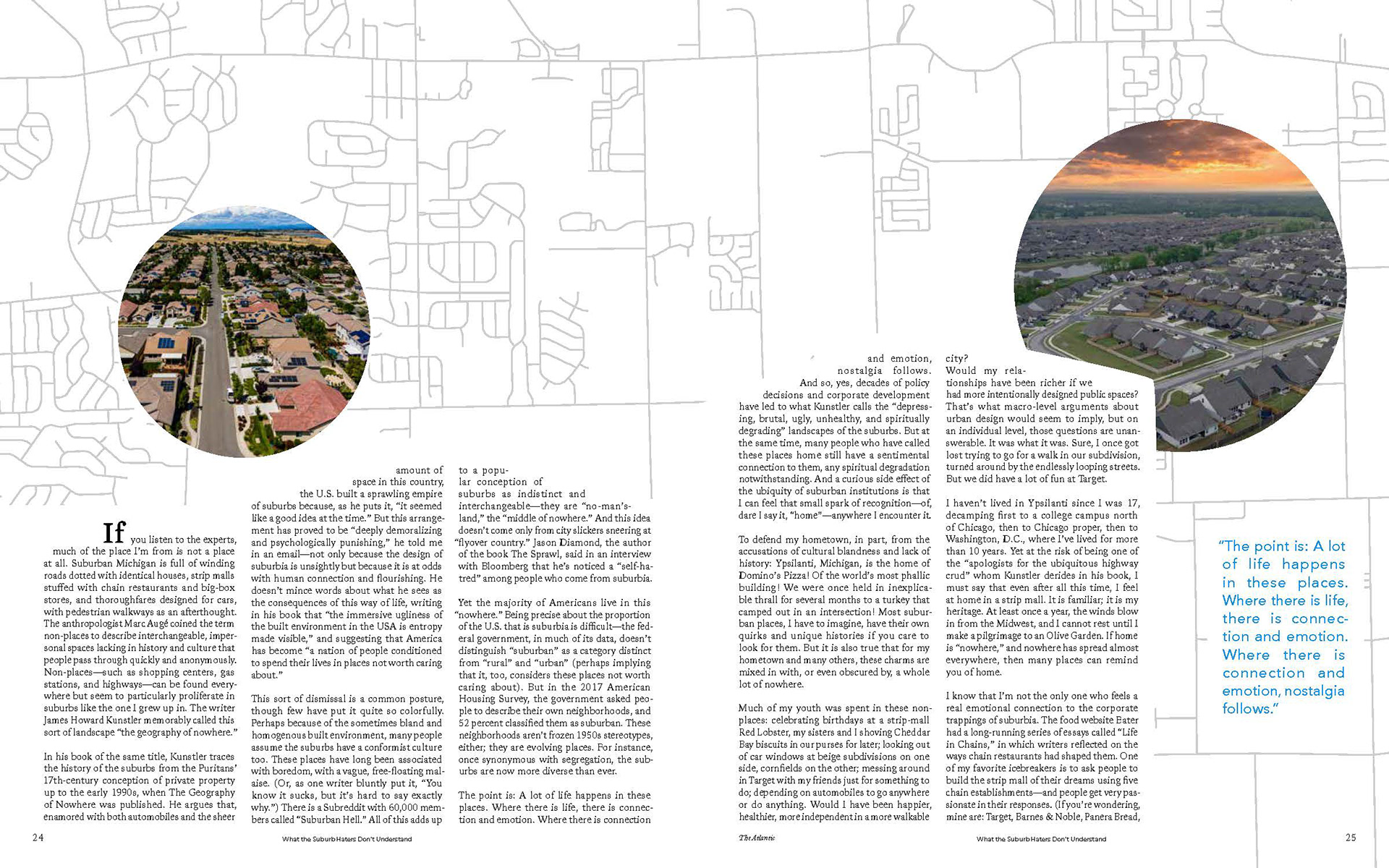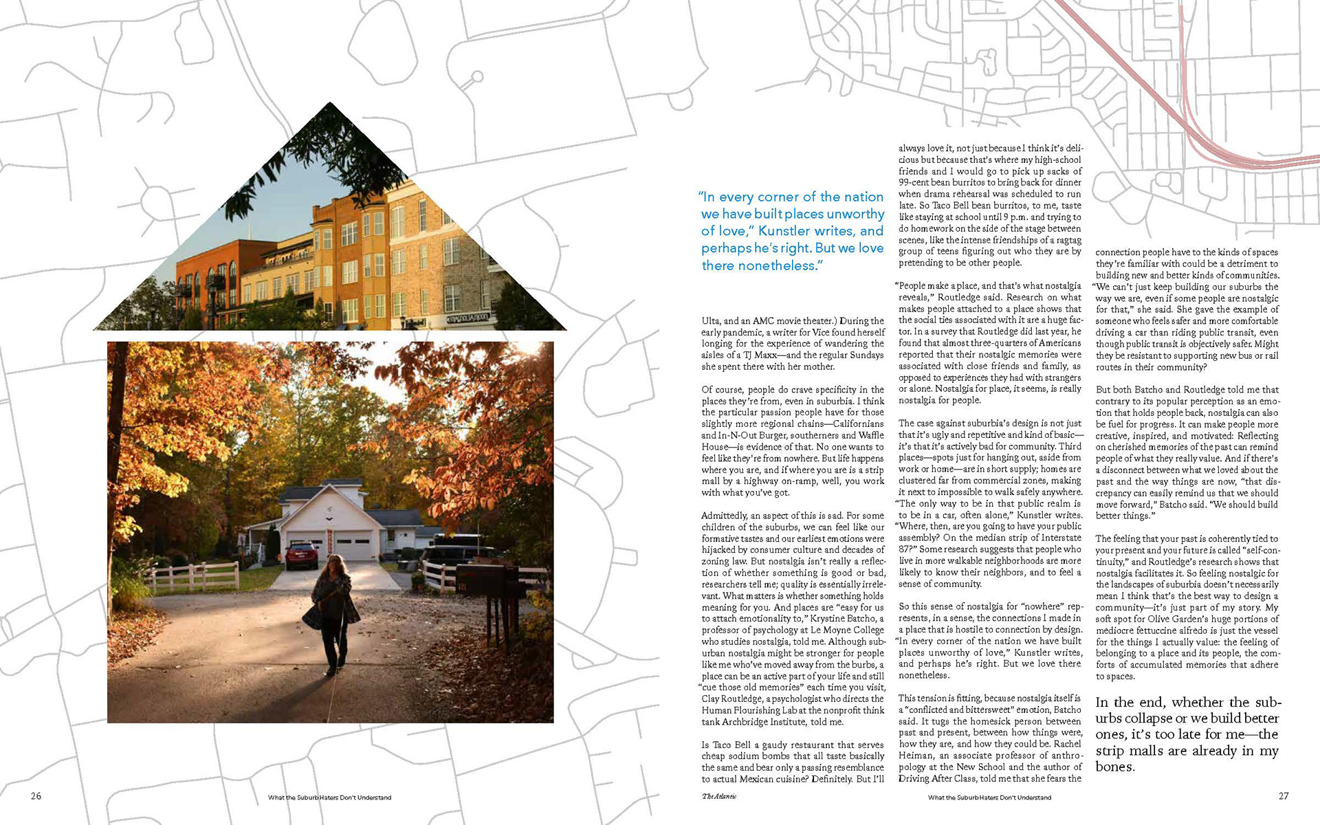
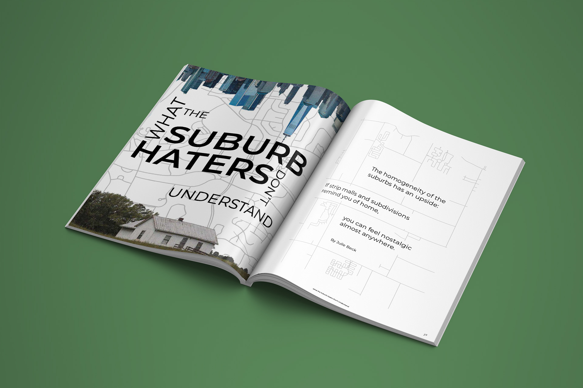
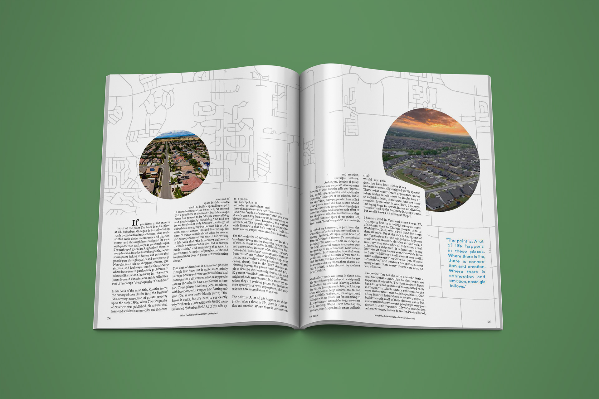
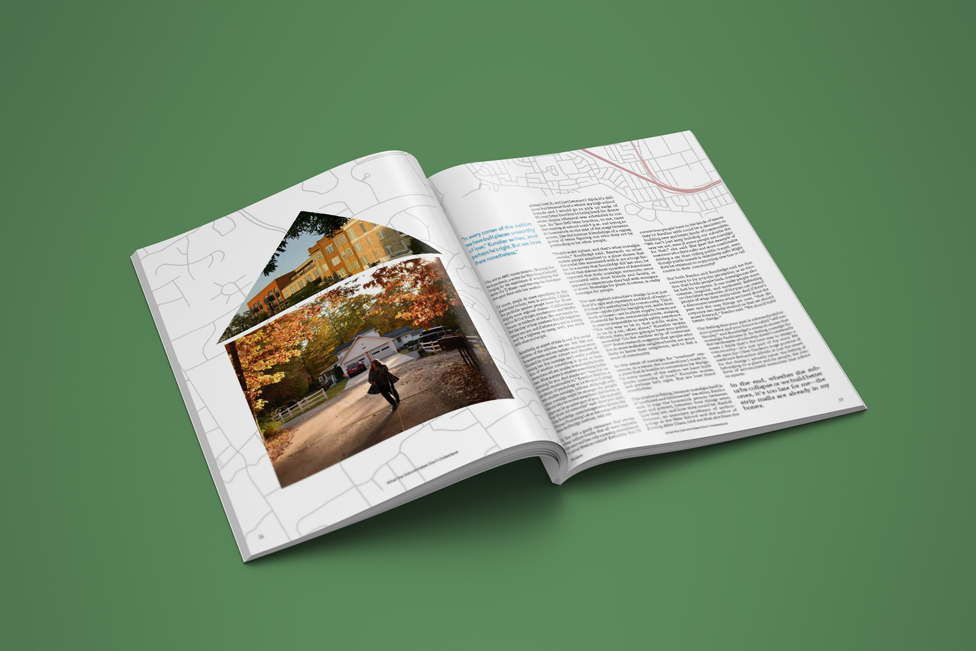
This project taught me to approach layout design conceptually. Instead of placing the text in traditional boxes, I wanted to align the design with the article's theme—nostalgia for the suburbs. I created text boxes that form houses on one spread and a city skyline on another. Additionally, the map in the background is of the author's hometown, which she frequently references in the article.
This process challenged me. I wanted my text to be legible, but I also wanted to have fun with the design aspect. Layout can be fun—you do not have to be constrained to what is typical. I wanted the article and layout to be one cohesive design, one unified voice, each enhancing the other to give the viewer and reader a deeper understanding.