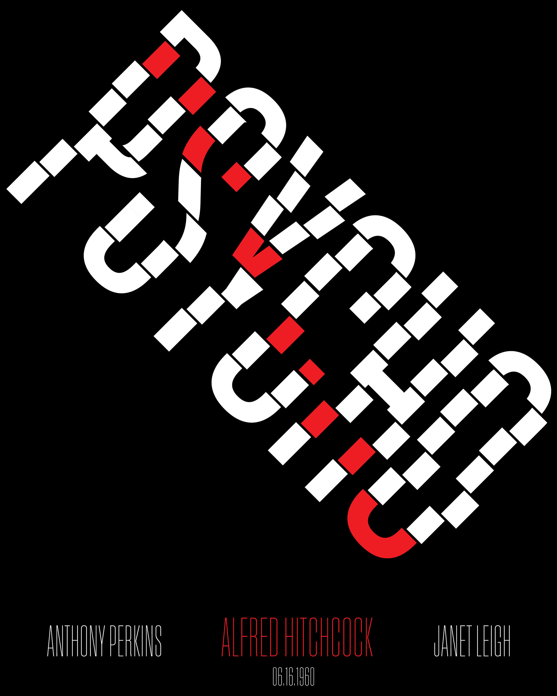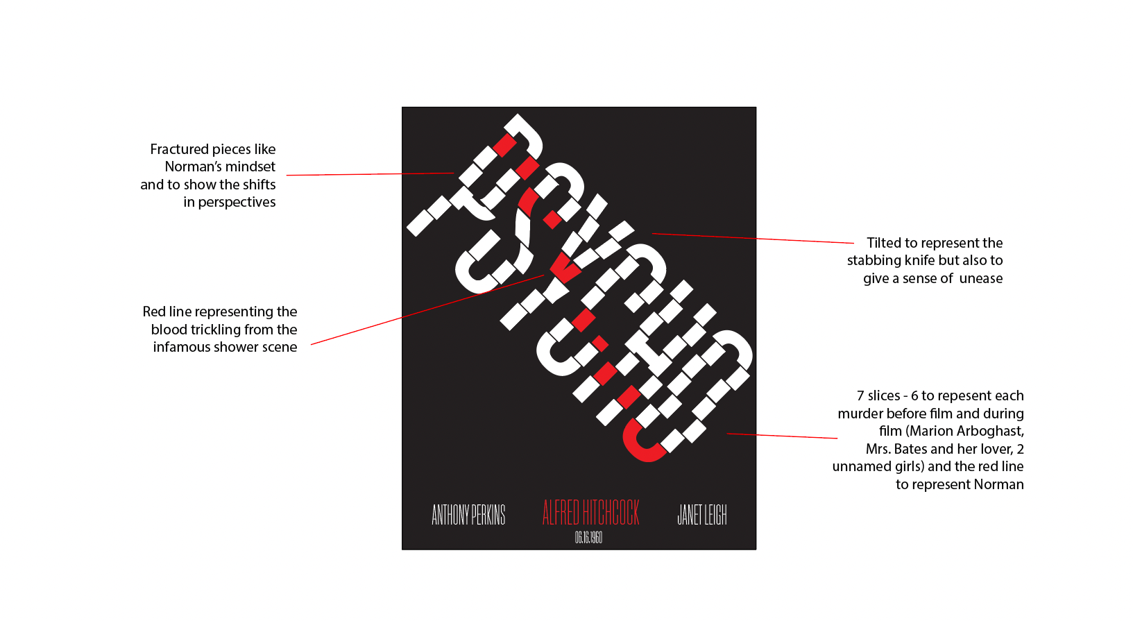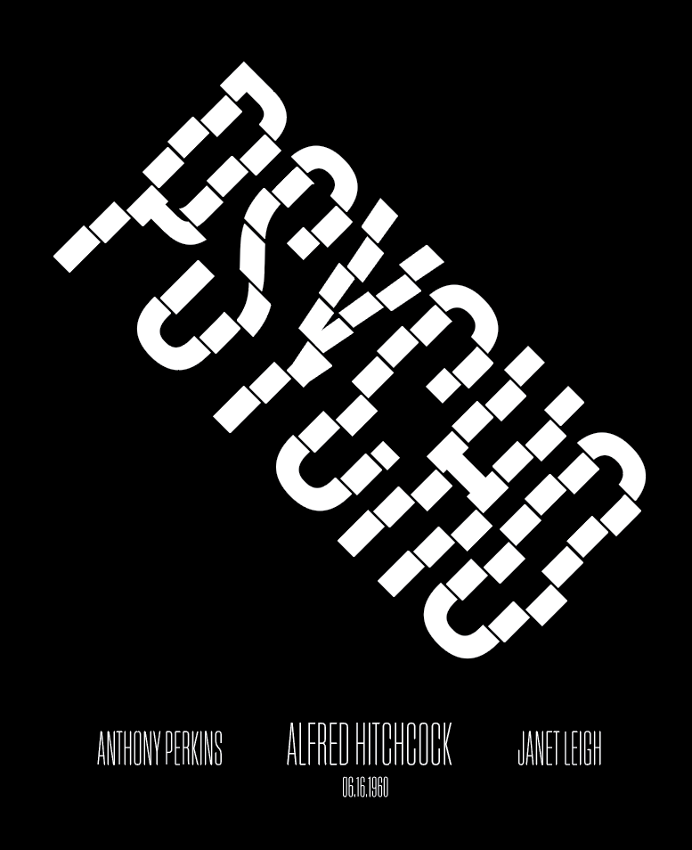
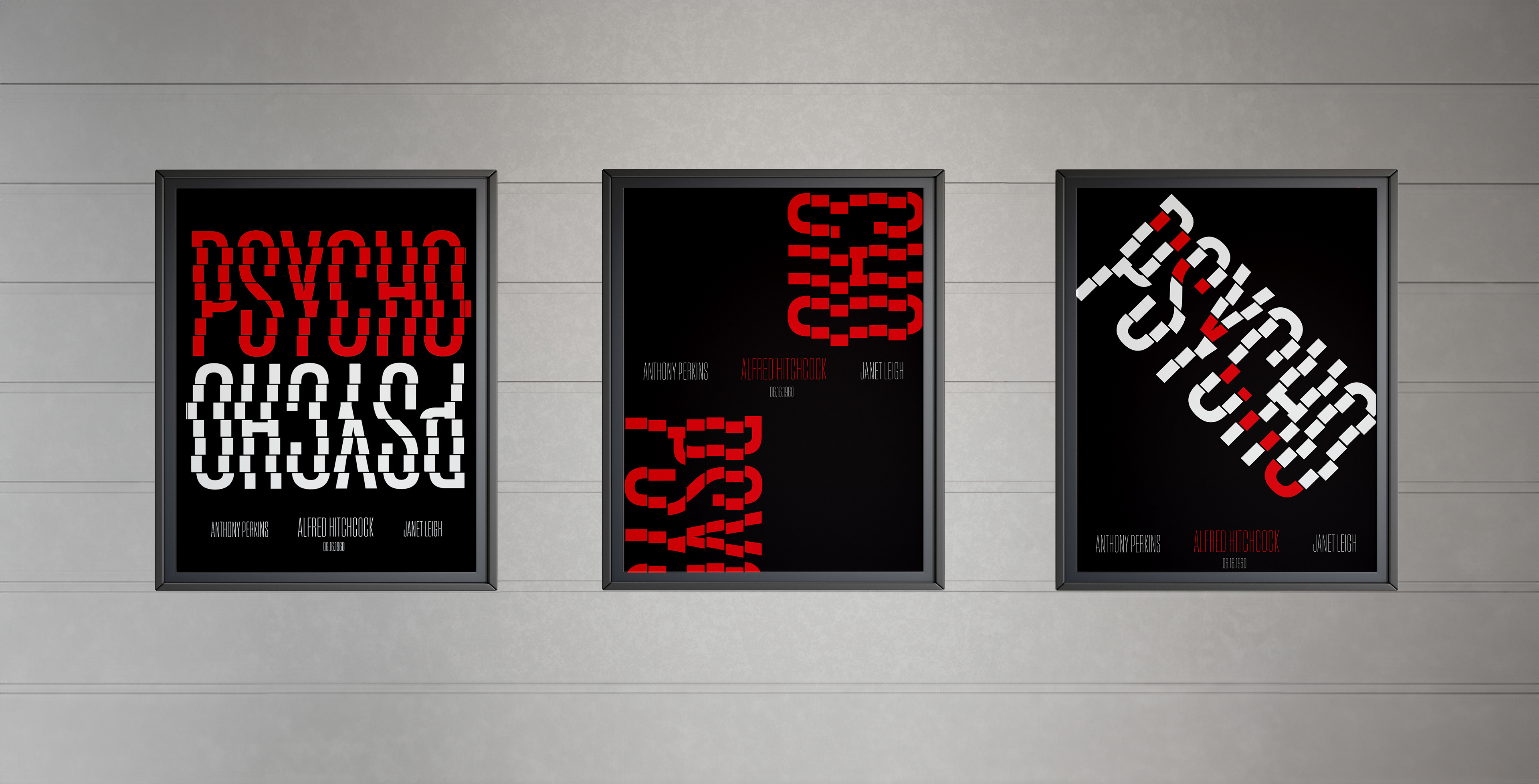
One of my favorite films of all time is Psycho (1960). The mystery, anticipation, and drama draw you in. For this poster design, I wanted to reflect on some of the key themes and iconic moments of the film while challenging myself to think outside the box by only using type.
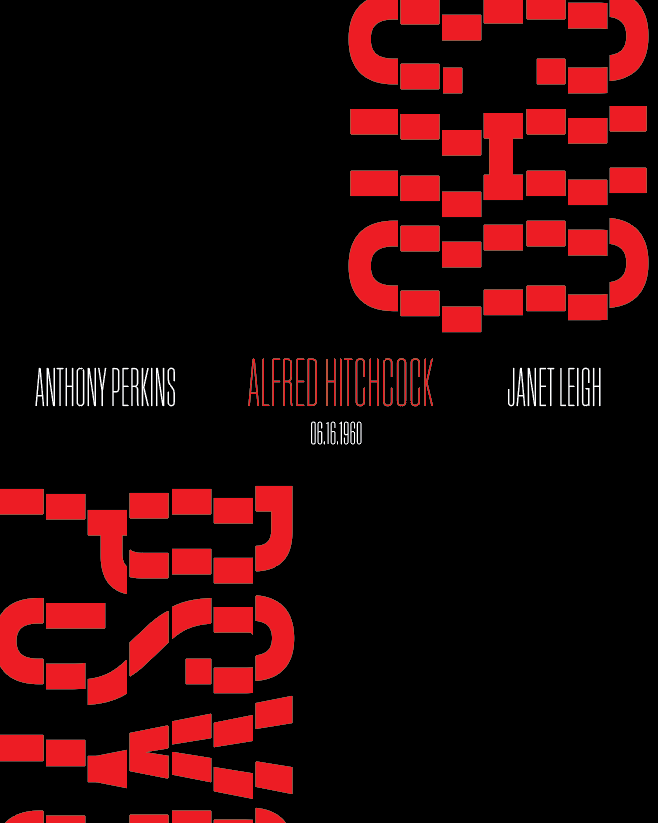
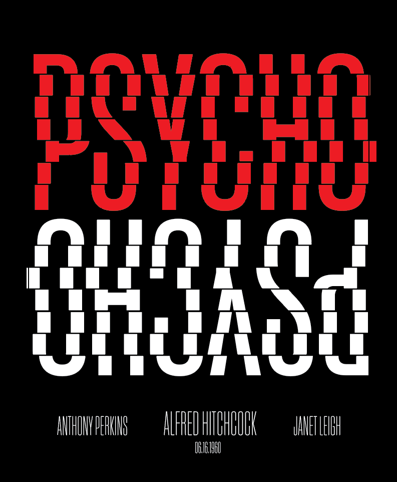
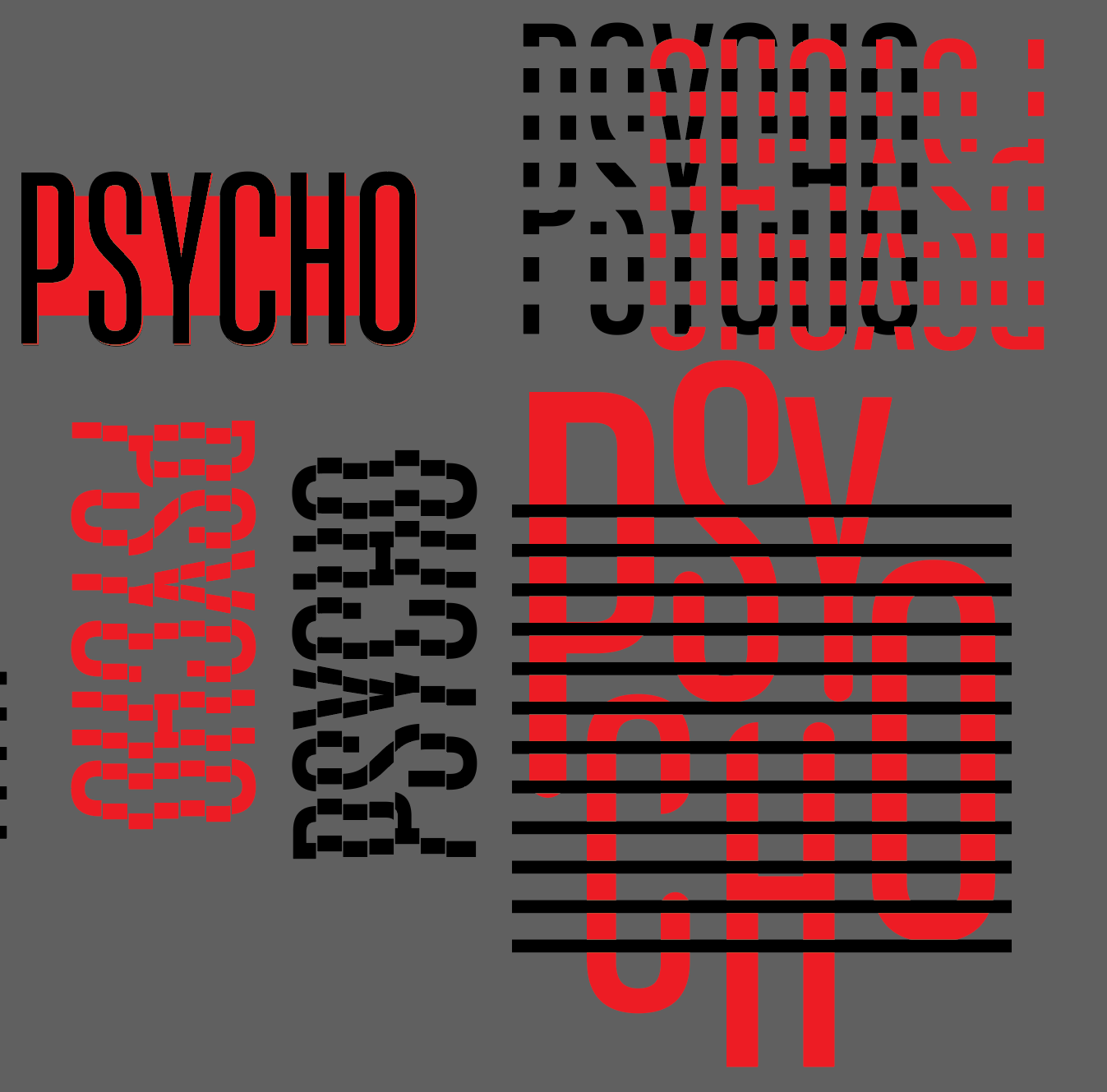
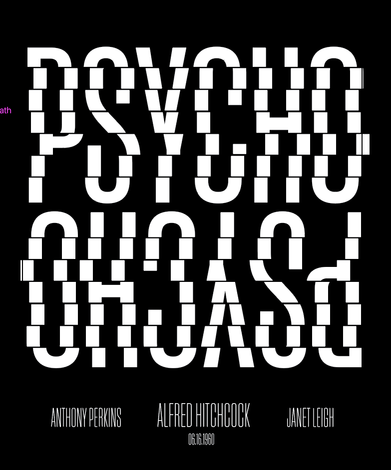
I knew immediately that I wanted the color palette to be extremely limited. black and white like the film, with a pop of color. Red was the obvious choice, adding that classic horror element while drawing the viewer's eye to exactly where I wanted it.
I was also inspired by the film's title sequence. I wanted to give a nod to the bar motif used by incorporating it into my type. It gives the title movement while being stagnant and helps create that unstable unease the viewer feels while watching the film. The bars also reflect the shifting narratives as well as the fractured mindset of Norman Bates himself.