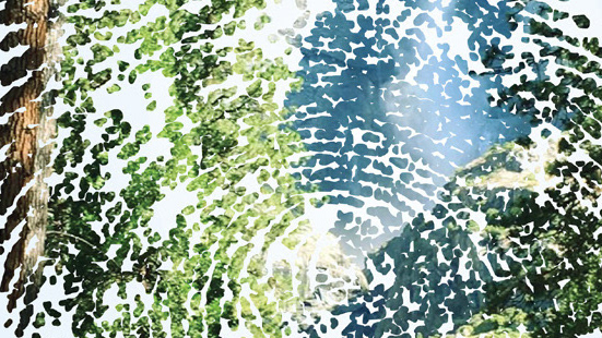
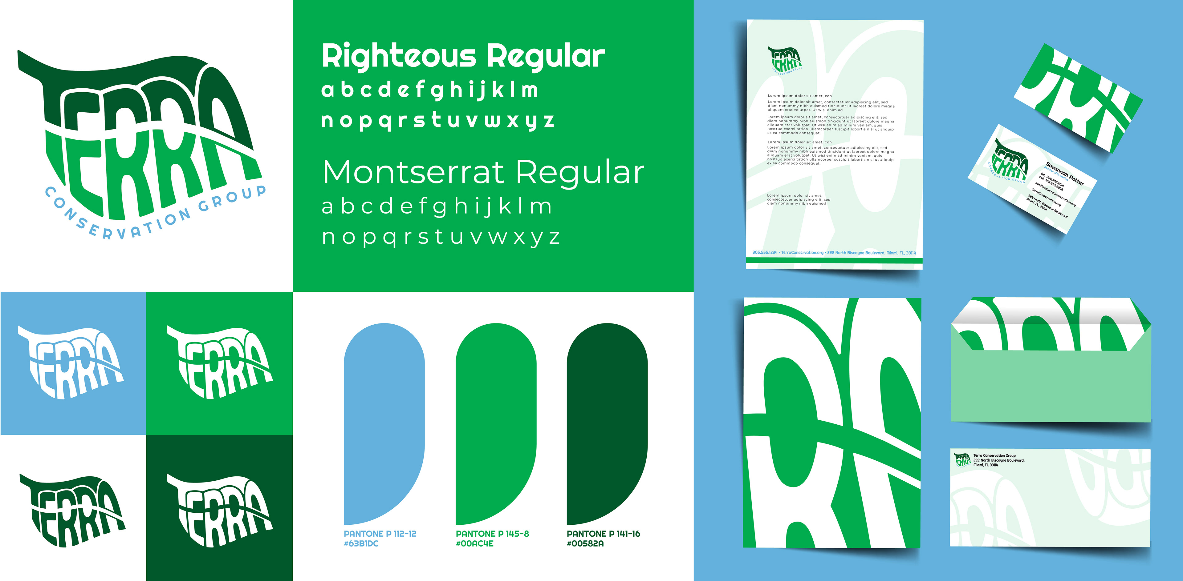
For this project, I was tasked with creating the logo, identity, and corporate stationery for Terra Conservation Group, a mock client aiming to engage a younger demographic in environmental and sustainability efforts. I wanted the design to reflect various aspects of environmentalism, starting with the color choices. I chose bright, energetic colors to appeal to a younger audience, with each color symbolizing something different: light blue for fresh water, bright green for flora and meadows, and dark green for lush forests and woods. Together, these colors, combined with the word 'terra,' form the Terra Conservation Group's logomark leaf.